Monday, December 8, 2008

Star plot


The star plot is a method of displaying multivariate data. Each star represents a single observation. A star plot is typically generated in a multi-plot format with many stars on each page and each star representing one observation.
Correlation matrix


A correlation matrix illustrates the correlations between all pairs of data sets.

Similarity matrix


A similarity matrix is a matrix of scores that express the similarity between two data points. The elements of such, measure pairwise similarities of objects; therefore, the greater similarity of two objects, the greater the value of the measure.

Stem and leaf plot


A stem and leaf plot is a type of graph that is similar to a histogram but shows more information. The stem and leaf plot summarizes the shape of a data set (the distribution) and provides extra detail regarding individual values.

Box plot


A box plot is a convenient way of graphically depicting groups of numerical data through their five number summaries (the smallest observation, lower quartile, media, upper quartile, and largest observation). Box plots can be drawn either horizontally or vertically.

Histogram


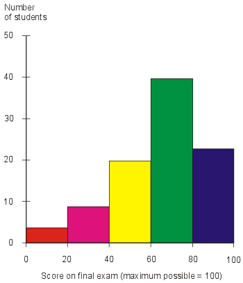
A histogram is a graphical display of tabulated frequencies, shown as bars. It shows what proportion of cases fall into each of several categories. A histogram differs from a bar chart in that it is the area of the bar that denotes the value, not the height as in bar charts, a crucial distinction when the categories are not of uniform width.

Parallel coordinate graph


A parallel coordinate graph is used to plot large multivariate data sets. Each variable in the data plot is represented as its own Y Axis on the graph. A maximum point for each Y axis is selected, and they are scaled relative to each other so that each variable takes up the same area in the graph space.

Triangle plot

The above triangle plot shows average admixture of five North American ethnic groups. Individuals that self-identify with each group can be found at many locations on the map, but on average groups tend to cluster differently.

Wind rose


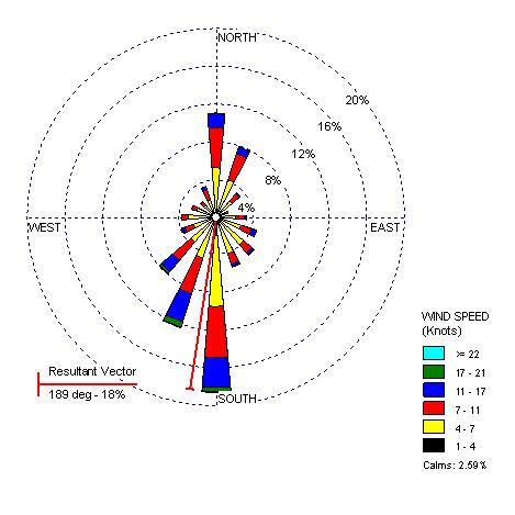
A wind rose is a graphic tool used by meteorologists to give a succinct view of how wind speed and direction are typically distributed at a particular location. Presented in a circular format, the wind rose shows the frequency of winds blowing from particular directions. The length of each "spoke" around the circle is related to the frequency that the wind blows from a particular direction per unit time.

Climograph


A climograph is a graphical depiction of the monthly precipitation and temperature conditions for a selected place. Precipitation is shown by the bar graph. A line graph depicts temperature.

Population Profile


Population profile simulating projected population structure with and without the AIDS epidemic, Botswana, year 2020.

Scatterplot


A scatterplot is a useful summary of a set of bivariate data (two variables). The data is displayed as a collection of points, each having the value of one variable determining the position on the horizontal axis and the value of the other variable determining the position on the vertical axis. It gives a good visual picture of the relationship between the two variables.

Index value plot


An index value plot is a means to depict the relativity of all values to an indexed value. Such graphical visualization is utilized in heavy measure on stock market analysis.

Lorenz curve


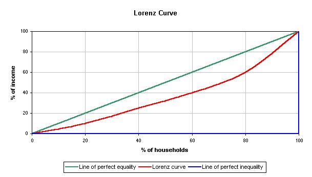
The Lorenz curve is a graphical representation of the proportionality of a distribution (the cumulative percentage of the values). It is often used to represent income distribution, where it shows for the bottom x% of households, what percentage y% of the total income they have. The percentage of households is plotted on the x-axis, the percentage of income on the y-axis.

Bilateral graph


A bilateral graph displays both positive and negative data representation against a zero line.

Nominal area choropleth map


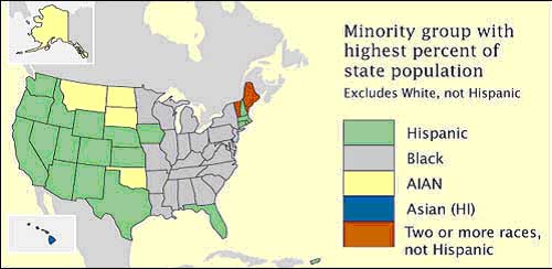
Nominal area choropleth maps present qualitative classification into groups and portrays no implicit ordering. As visually displayed above, ungraded colors (i.e. colors of equal visual weight) are often used in nominal maps since the observer is strictly interested in having the ability to distinguish between classes.

Unstandardized choropleth map


Unstandardized choropleth maps are not areally averaged in any way.

Standardized choropleth map


This is a standardized, areally averaged choropleth map. Cartographers often areally average choropleth map data in terms of density (persons per sq mile) or percentages (all data relativized to a scale of 0-100).

Univariate choropleth map


Univariate choropleth maps measure one (1) variable/data set cartographically. The above map is measuring poverty across the US, as expressed in "percentage of individuals."

Bivariate choropleth maps

http://www.geog.le.ac.uk/russianheartland/DemographicMaps/images/PopulationMaps/RaionMaps/7RaionPopDenPerCh8902.jpg
A bivariate map is a variation of a simple choropleth that portrays two separate phenomena simultaneously. The main objective of a bivariate map is to find a simple method for accurately and graphically illustrating the relationship between two spatially distributed variables.

Unclassed Choropleth Map


The unclassed choropleth map assigns coloring and shading that is proportional to the data values. This is done in order to alleviate the task of classifying the data.


Classed choropleth maps


The choropleth map is based on predefined areal units, such as states, counties, census tracts, etc. Here is an example of a choropleth map created on the U.S. Bureau of the Census web site. This map is based on state level data. Note the classed color and intensity of the variable being measured.


Range graded proportional circle map


Range-graded scaling: The data are divided into groups, using classification procedures common to choropleth mapping. The design goal is for symbol size discrimination, rather than magnitude estimation. The cartographer chooses symbol sizes for adjacent classes so that the map reader can easily distinguish between circle sizes, and therefore, categories.

Continuously variable proportional circle map


Proportional circle maps showing the distribution of A) Zn, B) Pb, C) Hg, and D) Ba in sediments from streams draining the Selwyn Basin, Yukon.

DOQQ


A digital orthophoto quadrangle (DOQ) is a computer-generated image of an aerial photograph in which image displacement caused by terrain relief and camera tilts has been removed. It combines the image characteristics of a photograph with the geometric qualities of a map.

DEM


A digital elevation model (DEM) is a digital representation of ground surface topography or terrain. DEMs are commonly built using remote sensing techniques, however, they may also be built from land surverying. DEMs are used often in GIS and are the most common basis for digitally-produced relief maps.

DLG


The U.S. Geological Survey's (USGS) digital line graph (DLG) files are digital vector representations of cartographic information. Data files of topographic and planimetric map features are derived from either aerial photographs or from cartographic source materials using manual and automated digitizing methods.

DRG


Digital Raster Graphics (DRGs) are optically scanned map images originally produced by the US Geological Survey (USGS). The raster image usually includes the original border information, referred to as the "map collar."

Sunday, December 7, 2008

Isopleths


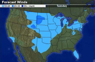
A feature of meteorological maps, isopleths are connecting points which have an equal value of some variable at a given time and spatial area. The particular variables shown on a given map may include values such as pressure, temperature, wind speed, etc.

Isopach


A line drawn on a map through points of equal true thickness of a designated stratigraphic unit or group of stratigraphic units.

Isohyets

A line joining points of equal precipitation on a map.

Isotachs


A line connecting points of equal wind speed. Isotachs are noted (green lines) on the above weather map.

Isobars


Lines of equal atmospheric pressure drawn on a meteorological map. Each line passes through a pressure of a given value, provided certain rules are followed.
The rules for drawing isobars are:
1)Isobar lines may never cross or touch.
2)Isobar lines may only pass through pressures of 1000 + or - 4. In other words, allowable lines are 992, 996, 1000, 1004, 1008, and so on.
3)The atmospheric pressure is given in millibars (mb). One millibar = 0.02953 inches of mercury.
4)Pressure lines are usually corrected for sea level so any differences in pressure due to altitude are ignored.

LIDAR


Light Detection and Ranging (LIDAR) is a remote sensing system used to collect topographic data. LIDAR is an optical remote sensing technology that measures properties of scattered light to find range and/or other information of a distant target. The prevalent method to determine distance to an object or surface is to use laser pulses (light amplification by stimulated emission of radiation).

Doppler Radar


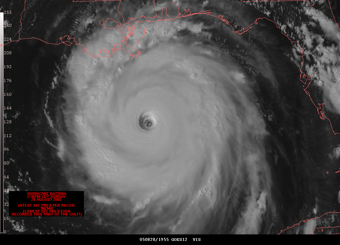
Above is a Doppler Radar observation provided by the National Weather Service. This image is that of the state of FL in infrared visibility. This type of radar is used to locate precipitation, calculate its motion, estimate its type (rain, snow, hail, etc.), and forecast its future position and intensity. Modern weather radars are mostly Doppler radars, capable of detecting the motion of rain droplets in addition to intensity of the precipitation.

Black & White Aerial Photo


Photographic film can be coated with different light-sensitive emulsions, each sensitive to specific wavelengths of electromagnetic radiation. Black and white emulsion is sensitive to approximately the same wavelengths as the human eye.

Infrared Aerial Photo


Infrared film and infrared digital sensors are sensitive to a certain portion of the spectrum of light, and by careful filtration, processing and selection of films, infrared aerials can provide invaluable information. IR film is commonly used to produce color-infrared photos. IR imagery uses false color, since we can’t really see the wavelengths recorded on infrared film. The varying reflections produce a contrasting effect (e.g., vegetation vs. water).

Cartographic Animation


Via cartographic animation, spatial visualization can be achieved. The basic goal of cartographic animation is the depiction of change, either temporal or non-temporal; however, most cartographic animations do depict change over time.

Statistical Map


Map in which the variation in quantity of a factor such as rainfall, population, or "how many online" in a geographic area is indicated. Choropleth maps are common statistical maps.

Cartogram


A cartogram is a map in which some thematic mapping variable is substituted for land area. The geometry or space of the map is distorted in order to convey the information of this alternate variable.

Flow Map

Cartographers have long used flow maps to show the movement of objects from one location to another, such as the number of people in a migration, the amount of goods being traded, or the number of packets in a network. The advantage of flow maps is that they reduce visual clutter by merging edges.

Isoline Map


An isoline map is a map with continuous lines joining points of the same value. Meteorologists use isolines to quickly show temperature difference on a map. The hottest areas are often colored red, the warm areas yellow, and the cold areas blue. Isolines are effective because they quickly communicate the distributions being examined. In addition to weather, isolines can also be used to describe any other type of data. Another common use of isolines is to show areas that are of the same elevation.

Proportional Circle Map


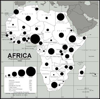
By applying a formula to control the area of the circles and then applying precise expansion factors, cartographers can create proportional circle maps in which the circle area reflects some attribute value. The above proportional data over Europe demonstrates how that the formula was applied (i.e. the larger the circle, the more Internet users).

Choropleth Map


Choropleth maps are very common. Most people have seen them, but few know them by this name. These maps use coloring and/or shading to depict values of selected characteristics. Choropleth maps are useful when the data is reported by area, not just by location or point.

Dot Distribution Map


Dot distribution maps are often called dot density maps because they show where particular data characteristics occur. Dot distribution maps use dots or other symbols to represent the number of occurrences of a given data characteristic in a particular location.

Propaganda Map

Propaganda is the dissemination of information aimed at influencing the opinions or behaviors of large numbers of people. Propaganda often presents facts selectively to encourage a particular synthesis or gives loaded messages in order to produce an emotional rather than rational response to the information presented.

Hypsometric Map


Map showing relief by any convention. and communicating three dimensional information. The third dimension can be relief (topography) or it can also be any other variable that describes a phenomena or process superimposed on the surface. This third dimension can be represented by color and shaping, raised relief and contour lines.

PLSS Map

The Public Land Survey System (PLSS) is a way of subdividing and describing land in the United States. All lands in the public domain are subject to subdivision by this rectangular system of surveys. The Bureau of Land Management is responsible for regulating and maintaining the PLSS.

Cadastral Map


A map used for recording title to a property. The map indicates legal boundaries and the ownership of the property. It may also show culture, drainage, and other features relating to land use and value.

Thematic Map

Thematic maps are data maps of a specific subject or for a specific purpose. They are designed to provide information on a single topic, such as "population percent change."